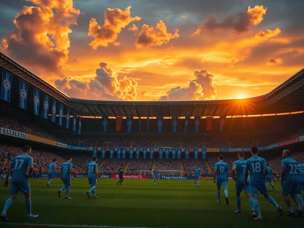
 Dalian Yingbo Hub
Dalian Yingbo has officially unveiled its new logo, marking a new image for the team in the 2024 season. The new logo is centered around a minimalist design concept that integrates city elements, with the word 'DALIAN' moved to the top and a restructured color palette that reflects the team's spirit and future vision. The main feature of the logo is a simplified horse's head, symbolizing the team's forward momentum and determination on the field. The letters 'YB' are cleverly arranged to form internal graphics, representing the spirit of fair competition in sports. After multiple optimizations by the design team, the final shield-shaped logo combines square and round designs, showcasing a balance of strength and elegance. As a football city in China, the logo design merges football with local characteristics, reflecting Dalian's unique circular road network. The font design emphasizes Dalian's spirit, with the letter 'A' integrated with the suspension cables of the cross-sea bridge, symbolizing hope and unity among the people of Dalian. The overall color scheme features blue, white, and red, with blue representing the tradition and legacy of Dalian football, while red signifies a hopeful outlook for the future. The release of the new logo not only redefines Dalian Yingbo's image but also continues and preserves the spirit of the team.
Club
Dalian Yingbo Unveils New Logo: Simplified Design Reflects City Spirit
Dalian Yingbo's new logo is unveiled, featuring a simplified design that integrates city elements, showcasing the team's spirit and future vision.